
UPshow Integrated Brand and Web Program
A cutting-edge brand identity and redesigned site deliver big performance improvements for interactive entertainment and marketing platform.
Overview
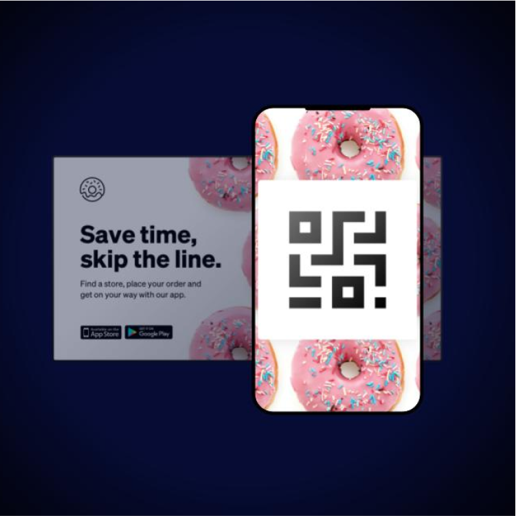
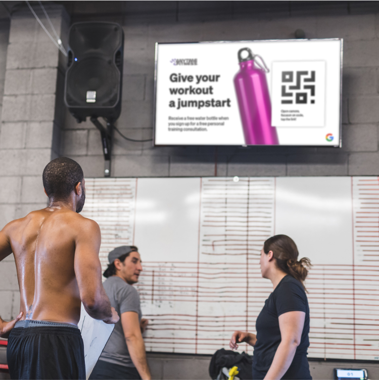
From the doctor’s waiting room to the walls of the gym to the menu at a favorite quick-service restaurant, onscreen marketing and entertainment are ubiquitous in pretty much every part of our daily lives. UPshow is behind many of those messages. The interactive entertainment and marketing platform, which works with businesses from restaurant franchises to healthcare clinics to fitness studios, turns TVs, mobile devices and POS systems into tools for revenue growth.
A recently added back-of-house product also allows UPshow customers to communicate with and incentivize their employees in new ways.
increase in enterprise leads
increase in leads overall in the first six months after rebrand
increase in overall monthly search traffic


The Challenge
UPshow came to Walker Sands at a major moment. The company was at an exciting stage in its journey, having recently secured an influx of contracts with enterprise clients.
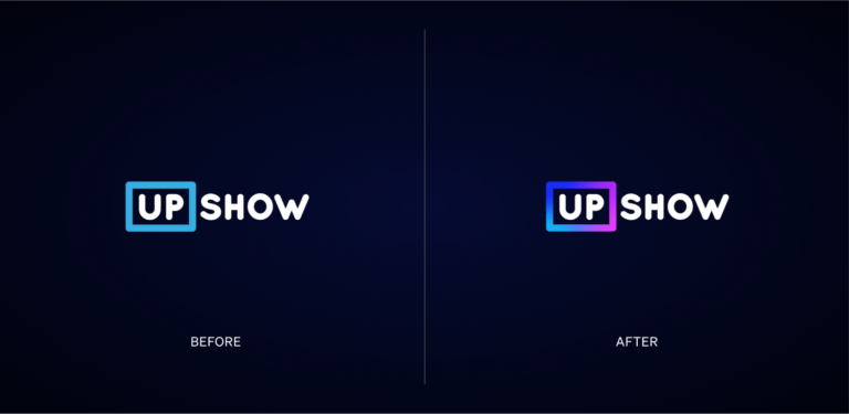
However, UPshow’s messaging didn’t concisely articulate its value to its diverse customer base. The digital signage product category is widely recognized, but historically has been positioned as a tool for communication rather than driving profit — and one that required active consumption of television. Its visual expression also failed to align with more sophisticated target buyers. In short, UPshow had outgrown its brand and website, and turned to Walker Sands to revamp its identity and website through an integrated brand and web program.
The Solution
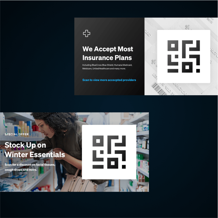
Relationships are critical to UPshow’s customers: A doctor and her patients; a restaurant owner and his Tuesday night regulars; a gym manager and their employees. Walker Sands zeroed in on messaging that positioned UPshow as integral to these relationships, with a brand promise focused on creating breakthrough moments of connection that deliver measurable impact beyond the screen. New messaging was adapted to fit UPshow’s three key audiences: fitness, hospitality and healthcare.
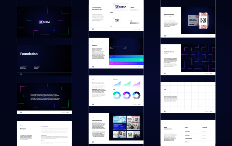
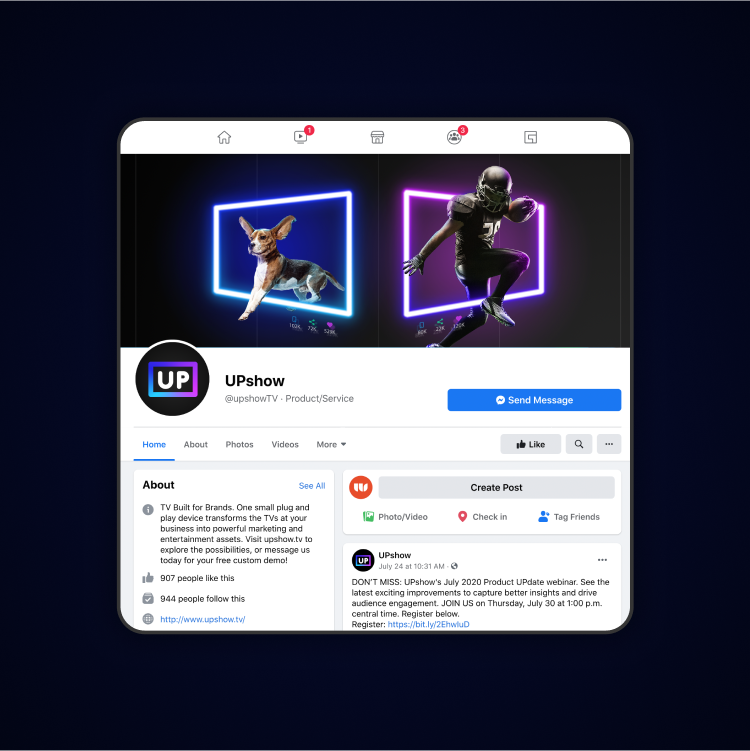
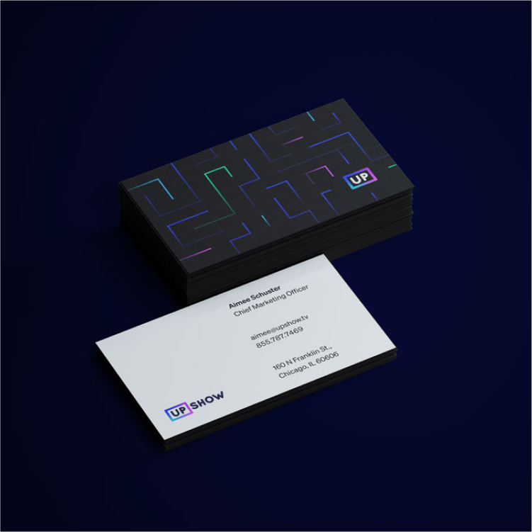
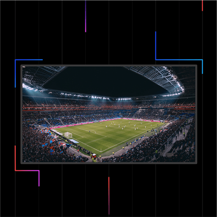
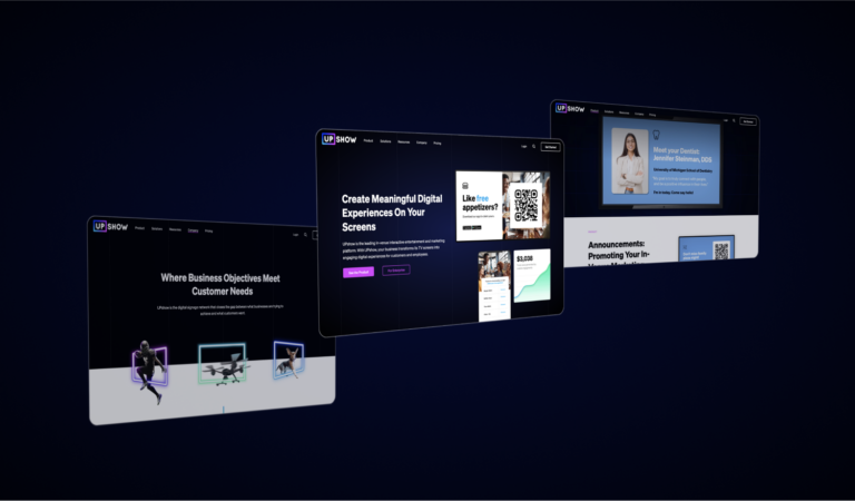
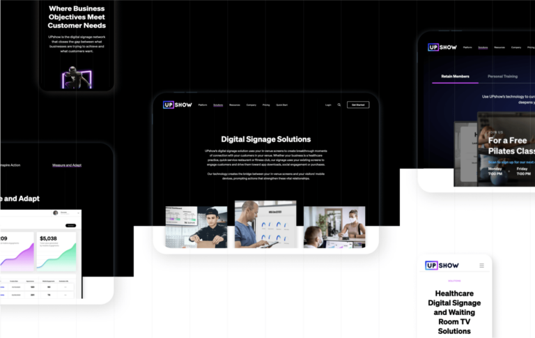
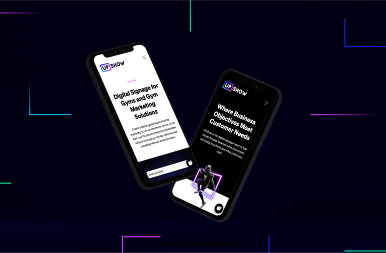
Because UPshow is featured on in-venue screens at all hours of the day (and night), Walker Sands explored visual identities that worked in both light and dark modes. Our eventual solution, a play on neon signage, is sleek and sophisticated while visually separating UPshow from its competitors. The “screen” frame in the UPshow logo acts as a dynamic brand device. In images for casual audiences like fitness and hospitality, football players and beagles leap through the frame, while images for sophisticated customers in areas like healthcare are more pared down.
When it came time to revamp its website, UPshow had several goals in mind: Convey the value of a “first-of-its-kind” in-venue engagement platform while still engaging customers looking for traditional digital signage — and impressing enterprise prospects. Walker Sands built a sitemap that catered to these audiences based on industry, use case and end goal, ensuring prospects understood the full potential of UPshow within their venues.

The Results
Faced with a pivotal moment in UPshow’s identity and company positioning, Walker Sands delivered a brand and website that up-leveled the organization from unsophisticated to cutting-edge. Performance improvements were extraordinary. Google Lighthouse scores jumped from F to A+, and monthly search traffic increased by more than 500%. And perhaps most importantly, UPshow gained a brand and website it could proudly present to highly desirable enterprise clients.

