Positioning a Global Information and Insights Leader Growth
Data-driven website redesign enables TransUnion to improve lead generation and content discovery.
Overview
TransUnion is a global information and insights company that helps consumers and businesses transact confidently by ensuring each person is reliably represented in the marketplace. With its strong foundation in core credit, the company now offers a broad suite of business solutions ranging from marketing and fraud prevention, to risk management and communications. These solutions help organizations across many industries better understand their customers — resulting in economic opportunity, great experiences and personal empowerment for tens of millions of people around the world.
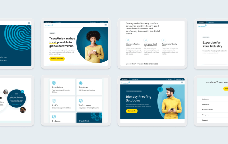
TransUnion turned to Walker Sands for a website redesign project that would improve the experience for key buyer personas through the design of original templates. The result was an updated B2B website that positioned TransUnion for growth among its targeted audiences.
decrease in average time for users to find their solution
Google Lighthouse SEO score
Google Lighthouse performance score
The Challenge
As TransUnion diversified and grew its product portfolio through acquisition and innovation, it was important visitors could quickly understand the breadth of its B2B offering and quickly find the solutions of greatest interest to them. The goal of the website redesign was to standardize interaction design to improve increased lead generation and content discovery.

The Solution
Enhancing brand strategy for target audiences
Walker Sands laid the groundwork for the site redesign with audience persona research. Our creative team conducted over 30 interviews with representatives from a diverse cross-section of TransUnion’s target audience segments. These interviews provided new insight into TransUnion’s target users for each of its products and services and how they viewed the website within their buyer journey.
Next, our team reviewed TransUnion’s keyword landscape, website analytics and competitor websites to inform copy templates for each of the 20 designed layouts.
We then used TransUnion’s updated product and solution architecture to restructure its sitemap. By organizing the navigation by solution, industry and business need, we created user flows that allow its audiences to easily self-segment to their needs.
Developing and testing responsive wireframe templates
We partnered with TransUnion to conduct validation testing on three versions of the proposed navigation. The resulting information enabled us to optimize and update content structure, organization and labels with confidence that it would lead to the ideal user experience.
Finally, the Walker Sands creative team partnered with TU’s digital experiences team to user-test 20 responsive wireframe templates for mobile, tablet and desktop. We restructured TransUnion’s existing content hierarchy for clarity and cleaner visuals, improving content discoverability.

The Results
With an insight-led and data-informed updated site design, TransUnion’s B2B site was positioned for growth among its targeted audiences. Through standardized, intuitive interaction design, TransUnion was able to improve lead generation and content discovery.
“The Walker Sands team was a true partner in our web experience redesign. I was impressed at their ability to quickly understand our wide array of target audiences and distill insights into a more intuitive website experience. We’re already seeing tremendous across-the-board web performance improvements as a result.”
Maxwell Julius
Vice President, Global Digital Experience, TransUnion

