Integrated Project Positions Clarus Direct as Pioneer in Retail Media Partnerships
Rebrand and web redesign project repositions Clarus Direct as a pioneer in retail media revenue.
Overview
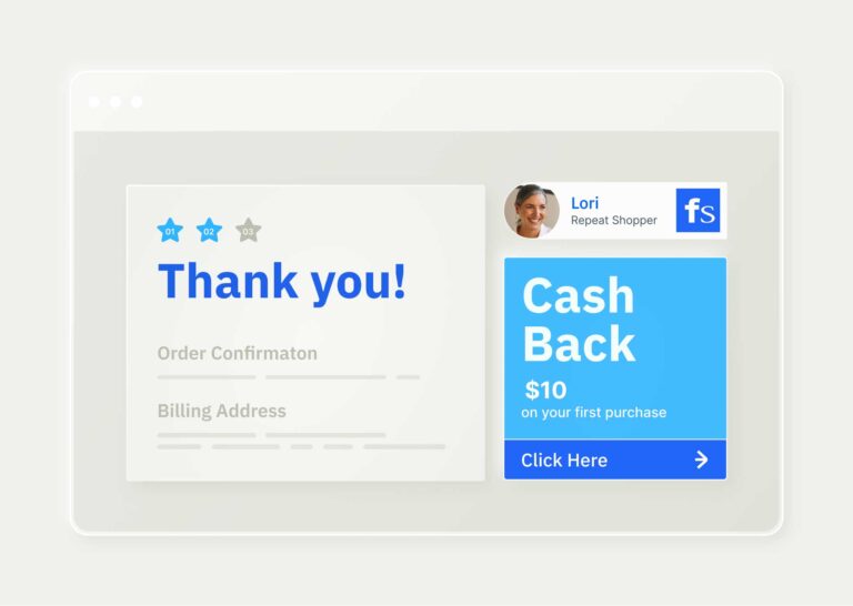
Clarus Direct creates win-win shopping experiences for consumers and e-commerce brands. The business’ consumer programs help over 600,000 online shoppers earn free shipping, cash-back rewards and millions in savings. Through its media partner program, Clarus Direct enables e-commerce businesses to earn incremental revenue by displaying digital ads for its consumer programs.
While Clarus Direct’s consumer-facing programs were well known, its B2B media partner program lacked visibility. As a result, Clarus Direct partnered with Walker Sands for a rebrand and website redesign to position the company as a pioneer in retail media partnerships.
Google performance score
accessibility score
best practices score
The Challenge
When we began our work with Clarus Direct, it existed under the umbrella of ebbo, a customer engagement company that partnered with Walker Sands on a similar project. As Clarus Direct began to embrace its B2B identity, our challenge was to build out a brand that was distinct, yet connected to ebbo’s business and brand identity.
Additionally, the existing Clarus Direct landing page and program pages lacked information or benefits for its media partners. So, our team needed to start from scratch with a new visual identity and messaging to establish Clarus Direct as its own, innovative B2B business.


The Solution
Our branding phase began with stakeholder interviews, a competitor analysis and audit. After gathering industry insights, we built a brand foundation that directly spoke to Clarus Direct’s B2B audience and centered on the business’ reinvention of e-commerce media revenue.
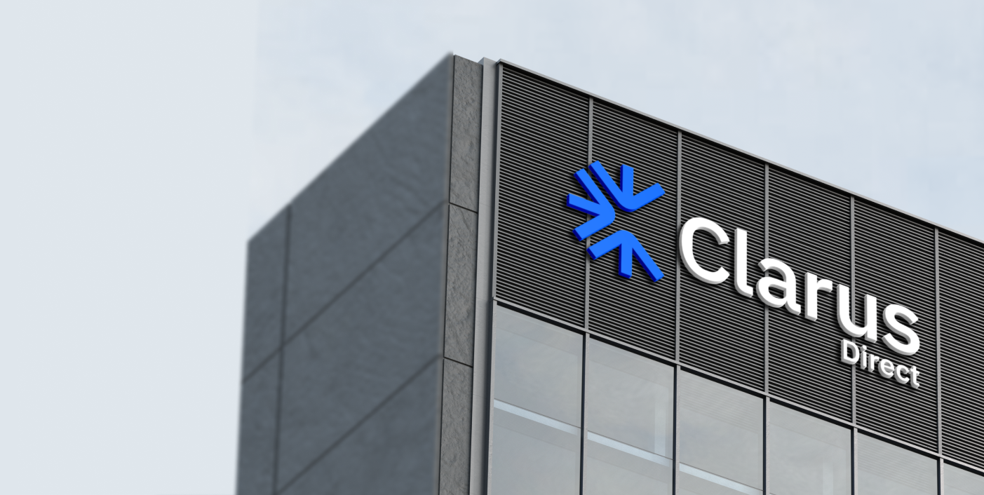
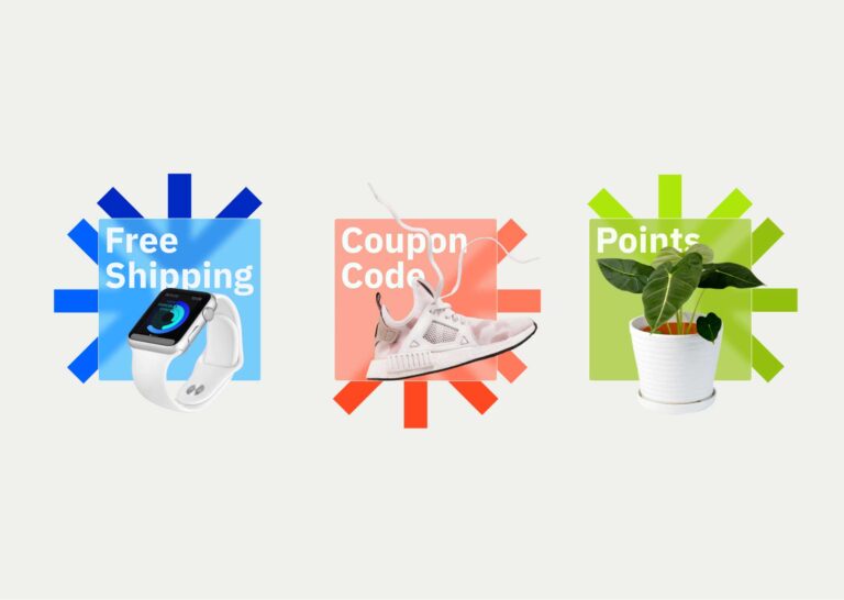
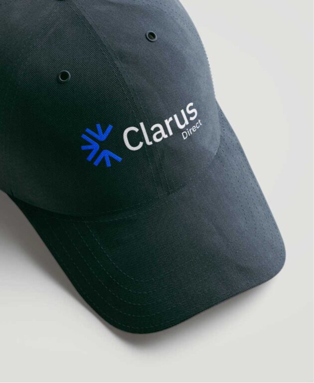
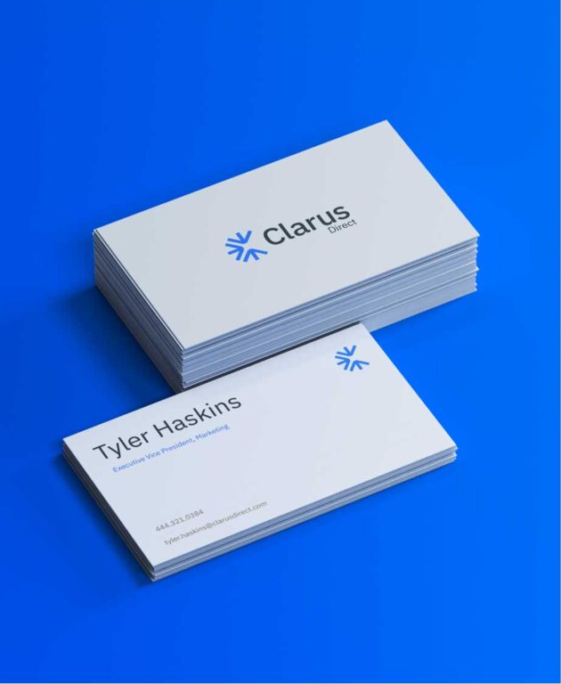
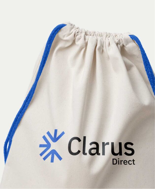
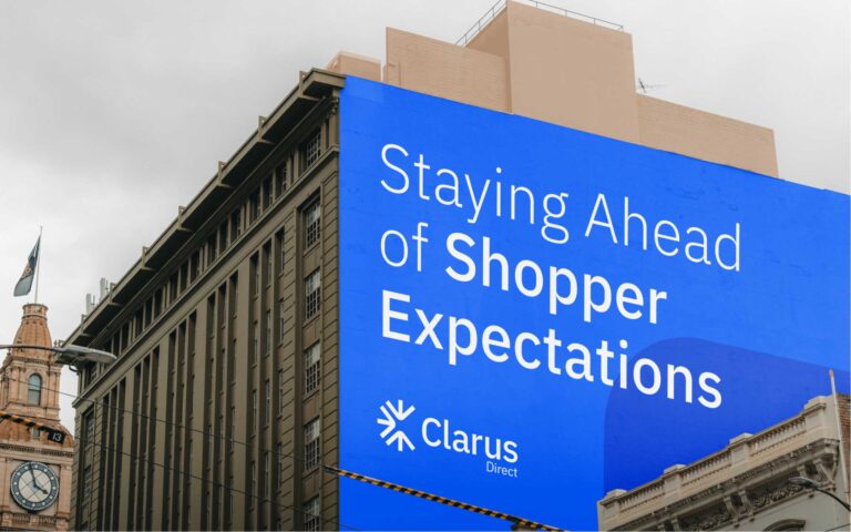
The team began the brand expression process with a new brand device — a “burst” mark with arrows that represented the three Clarus Direct programs and the business’ innovation in the industry.
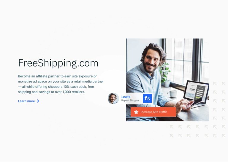
We embraced a more modern look for the new brand while adding in human elements with photos of client partners and consumers. Our color palette included the same primary colors as the ebbo brand. However, we also introduced a second, separate palette to better position Clarus Direct as a distinct entity.
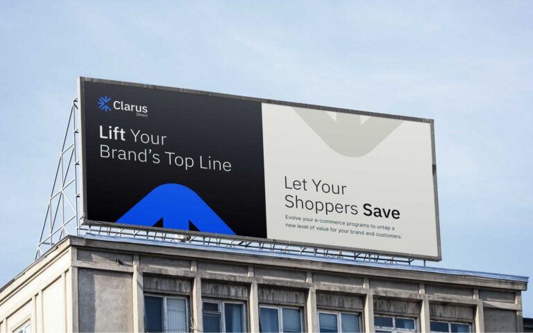
Next, we worked to reposition Clarus Direct’s messaging, shifting from a consumer-facing approach to the new B2B focus. The new messaging frameworks targeted e-commerce retailers interested in boosting incremental revenue via ad placements with Clarus Direct. Our team established a forward-thinking, confident and charismatic tone to match Clarus Direct’s dynamic retail programs.
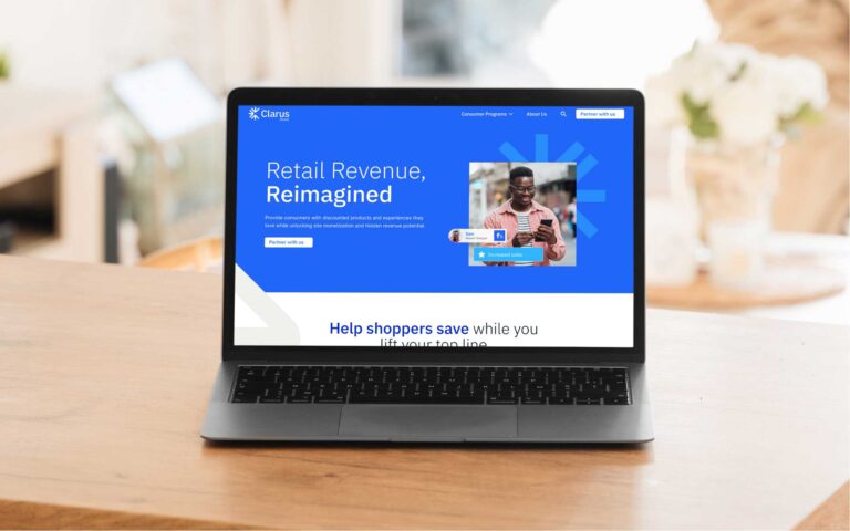
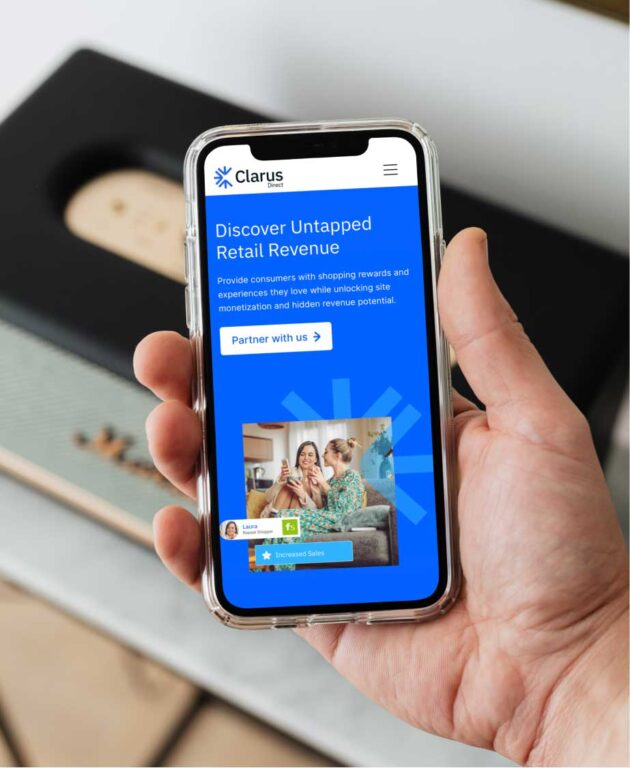
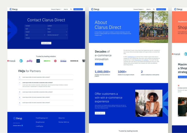
As we moved into the web redesign phase, our team expanded Clarus Direct’s site from a single landing page to a six-template design. With more room to tell Clarus Direct’s B2B story, our team brought the Clarus Direct brand to life with strategic application of the new photography, color palette and typography on desktop and mobile designs. The result is a more informative, cohesive web experience that better explains Clarus Direct’s media partner benefits.



The Results
Our work helped Clarus Direct define itself as an B2B media innovator that exists outside of ebbo’s shadow.
By providing Clarus Direct with a distinct brand identity from its parent company, we helped the company establish long-term brand equity and better communicate with B2B retailers.
With an ownable web presence, Clarus Direct can also more effectively share B2B partner benefits and increase lead generation. Since site go-live, Clarus Direct has achieved 100% performance and best practices scores, a 98% accessibility score and a 92% SEO score.

