Billtrust Brand and Website Redesign
A brand refresh and website redesign brings focus, clarity and consistency to a fast-growing fintech company.
Overview
As the leading provider of order-to-cash solutions, Billtrust has always focused on making it easier for companies to get paid. Over time, Billtrust’s brand had become inconsistently applied and outdated due to the company’s successful growth and acquisition of new products and organizations. The firm’s newly-appointed SVP of Marketing knew that the growing company needed a “north star” to guide future marketing efforts in a consistent and unified way.
Walker Sands partnered with Billtrust to implement a wide-ranging program including brand work, a website redesign, content development, product architecture, user experience / buyer journey design and marketing automation implementation that improved web performance while visually aligning the company to its leadership status in the market.
new custom identity system, brand guide and website
increase in YOY organic traffic
increase in conversion rate
avg. improvement in Google Lighthouse scores


The Challenge
As Billtrust expanded over time with new solutions and company acquisitions, the brand grew to claim a wide variety of identities built on 24 disparate brand attributes. Consequently, its brand identity was no longer clearly defined and lacked a unifying theme.
Visually, the brand’s marketing assets struggled with inconsistent application across various collateral and marketing channels. The Billtrust logo didn’t have well-defined implementation guidelines, and marketing assets (case studies, sell sheets, etc.) lacked a typographic hierarchy and a uniform content structure. As a result, Billtrust’s branding was confusing and audiences couldn’t easily grasp the firm’s positioning, personality or value propositions.
At the same time, Billtrust’s website suffered from a variety of product architecture, design and performance issues. Billtrust’s portfolio of products had various naming conventions and weren’t organized in a way that was easily intuitive to visitors. Additionally, the website had an outdated design aesthetic and struggled with issues related to performance, security, accessibility and responsive best practices.
When Billtrust hired a new SVP of marketing – a former Walker Sands client – he knew a strong agency partnership could help deliver a modern, sophisticated brand identity, website and marketing materials that matched the company’s position as a leader in the space.


The Solution
With an expert team of branding strategists, designers, content creators and web developers, Walker Sands got to work on this ambitious undertaking.
Brand Discovery and Strategy
The Walker Sands team started by conducting an audit of Billtrust’s marketing assets and interviewing members of its leadership team. Walker Sands also performed a competitive analysis to identify opportunities to differentiate Billtrust by developing a visual identity the company could clearly own.
Based on this research, Walker Sands prepared brand concepts that would resonate with Billtrust’s target audiences while being uniquely differentiated in the marketplace.
Brand Guidelines
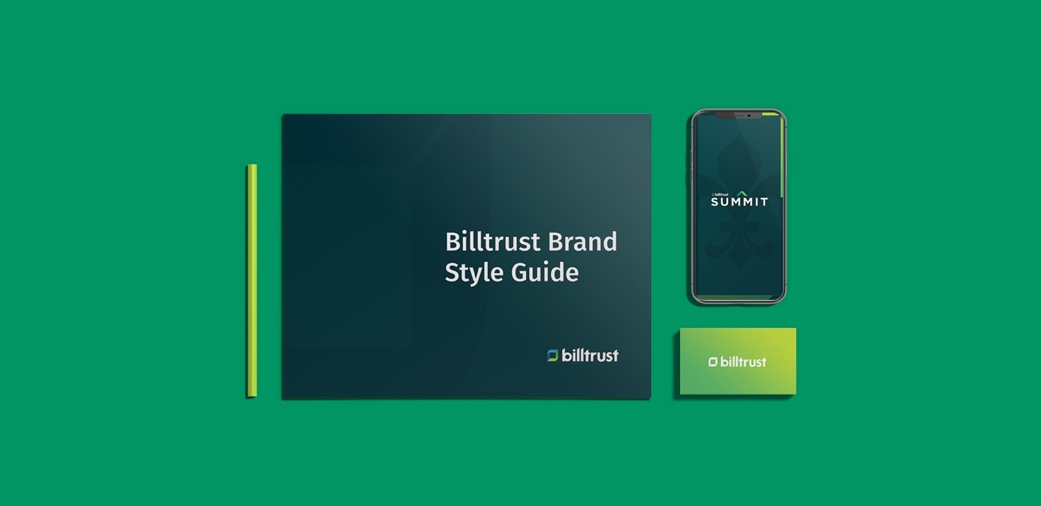
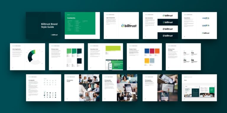
Upon selection of the new brand design system, Walker Sands helped develop a rigorous set of application guidelines to ensure fidelity and consistency. The Billtrust Brand Style Guide defined rules for the consistent use of its logo, badge, primary and secondary colors, typography, iconography and photography. The style guide also provided clear direction on how acquired companies could consistently be assimilated into the Billtrust brand.
Brand Collateral
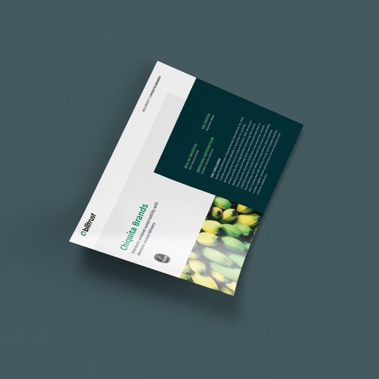
Following the brand project, Walker Sands immediately got to work updating dozens of marketing collateral including conference signage, sales decks, direct mail materials, case studies, white papers, sell sheets and more. This work required collaborating with a number of different Billtrust departments and their associated vendors to ensure design and messaging consistency across channels.
Website Redesign
The largest of these initiatives was a full Billtrust.com website redesign and rebuild. Walker Sands’ content strategy and design teams first mapped out the optimal organization of website content through a new sitemap recommendation. Next, the team moved on to page-by-page recommendations with wireframes outlining the ideal user flow and user experience for how to move leads through the funnel of awareness, education and conversion.
A major part of the design process included the presentation of three distinct homepage concepts for Billtrust to choose from. The marketing team’s selected concept exhibited the “sophisticated tech” aesthetic they were aiming for and helped to guide all subsequent design decisions for the rest of the site in terms of color palette, photography treatments, button styling, etc.
Product Architecture
Throughout this process, Billtrust was working on a parallel initiative to rename and re-organize their product offerings, which had acquired various labels and naming conventions over time. Walker Sands helped map out a website flow to show how these products were related to each other at various levels (e.g., “Credit Application” and “Credit Management” both being sub-offerings within Billtrust’s “Credit” suite).
Walker Sands also developed seven new motion graphics animations to showcase each product’s features and benefits.
Content Development
Walker Sands was also charged with a major initiative to develop new content for the website. This undertaking required a close collaboration with various subject matter experts at Billtrust, including product teams, marketing, sales and HR. First, Walker Sands conducted a content audit of over 800 URLs on Billtrust.com to determine which webpages were performing well, which webpages needed optimization or writing help and which pages were missing entirely and needed to be developed from scratch.
The new content strategy included extensive keyword research and search optimization for 35 pages of new content, along with a full redirect strategy spanning the entire website, meaning old content on their website now directs to more helpful resources, building credibility with Google.


The Results
With a new brand identity, marketing collateral and website, Billtrust was armed for success with existing customers, new prospects and internal audiences.
Billtrust leveraged its annual user conference as a first step in showing off the new branding through Summit marketing materials, which received glowing reviews from customers and internal stakeholders alike. Over the subsequent months, Walker Sands helped update more than 95 pieces of marketing collateral, including email templates, case studies and, finally, the website.
Early results show these efforts have been successful thus far at increasing audience engagement and increasing the brand’s visibility online, with a 31% increase in YOY organic sessions, a 21% increase in time spent on site and a 65% increase in conversion rate (form fills). Much of this success is owed to the website’s 55% improvement in Google Lighthouse scores and 79% improvement in pageload times. Billtrust’s marketing efforts have supported YOY double-digit Annual Recurring Revenue (ARR) growth for the firm.
