
Illustration Refresh and Website Redesign Enhances Engagement for NMI
A new illustration library and web design sets up the payments solution provider with a more customizable website.
Overview
As a payment solutions provider, NMI is the force behind billions of dollars of global transactions. NMI provides its unified payment platform to more than 1,000 technology partners and 100,000 merchants in the retail, transportation, hospitality, medical, nonprofit, parking and vending industries.
Despite a solid site foundation, NMI was looking for a more cohesive and modern web presence that spoke to its wide range of prospective customers. Enter Walker Sands.
increase in direct sessions
increase in overall users
increase in new users

The Challenge
The NMI team had recently completed a full web redesign to merge their messaging with an acquisition. However, the result was more of a Band-Aid fix than a site that worked for NMI’s needs. The site lacked cohesive messaging and design, and left the team with a fragmented CMS.
Additionally, NMI was looking for a full illustration revamp. NMI’s existing illustrations failed to showcase NMI as an approachable, human brand, and the company needed a more flexible illustration library.

The Solution
NMI offers solutions that can be leveraged by almost any business that needs a payment gateway — a benefit to its partners, but a challenge to convey. By conducting interviews with banks, PayFacs, ISVs and ISOs, we built web personas that identified customer needs and pain points for NMI’s key customers.
We leveraged these personas and a content audit to build a web strategy and sitemap that enabled users and search engines to navigate the site. The result was a navigation that balances self-segmentation with SEO and performance best practices.
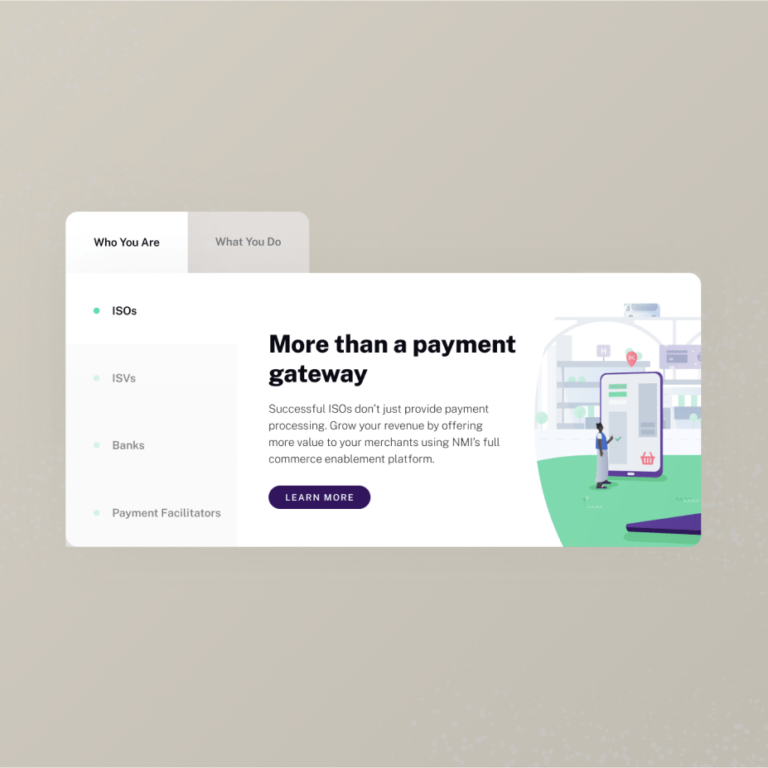
During wireframes, we developed a careful hierarchy across each page to organize NMI’s product suite and benefits across industries. We prioritized clean, digestible content blocks and created space to highlight NMI’s new illustrations. During this process, our integrated approach shone through as our designers and illustrators worked together to create pages that strengthened the user experience and storytelling.
In our design phase, we built on the equity NMI had developed in their recent brand refresh. We applied the company’s new color palette, typestyle and iconography updates — translating the brand to the new site while setting the tone for future brand application.
Illustration
From the beginning, our team set out to create a revamped set of illustrations that could change with NMI’s needs and prioritize inclusivity.
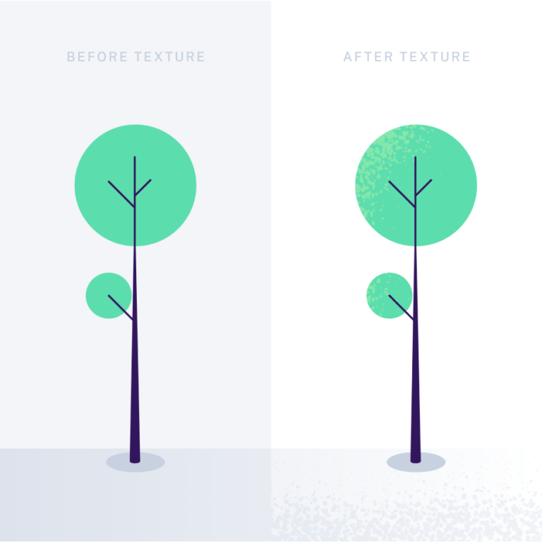
We started the creative process by presenting two mood boards to align on creative direction with NMI. From there, we sketched layouts and created two concepts for the team. The approved concept included custom textures and bright colors that softened their approach while adding impact.
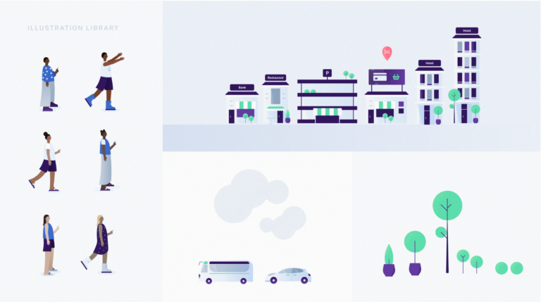
We prioritized diversity throughout our process by adding illustrations with different body types, skin tones, heights and genders — enabling NMI to apply different characteristics through their illustration library.
Illustration Library
To provide limitless flexibility and true inclusivity, we built an illustration library that enabled NMI’s team to create new layouts for different assets. After we completed concepting, we consolidated illustration elements into different layers in a single illustrator file.
The result is a completely customizable sandbox that allows the NMI team to plug and play different buildings, landscapes, skin tones, hair colors, clothing, textures and more.
Illustration Activation
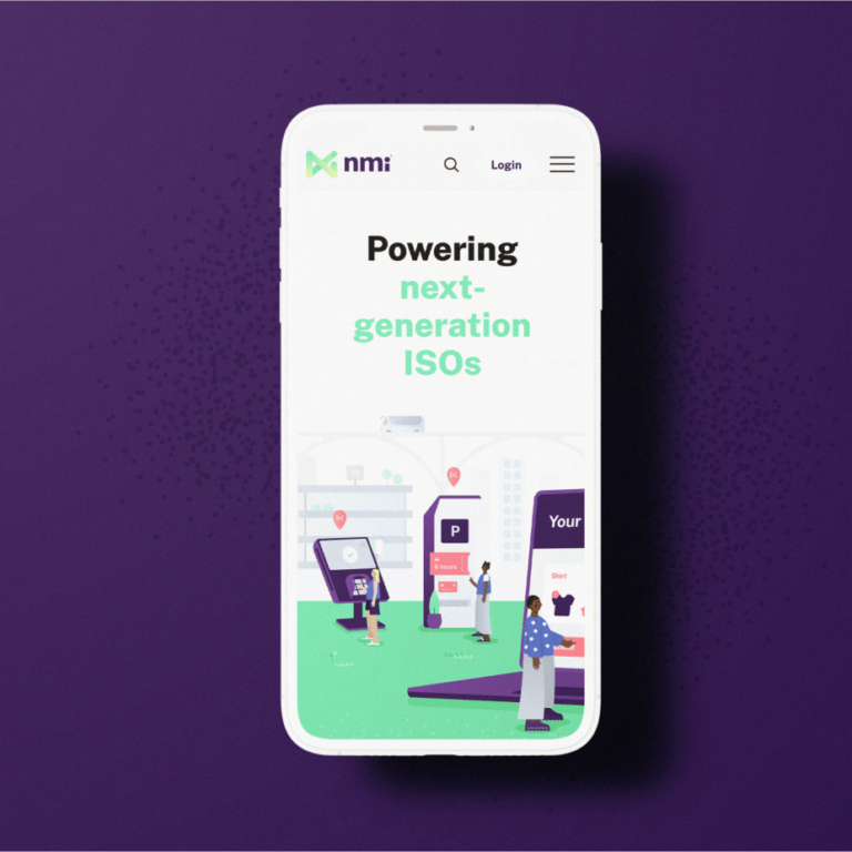
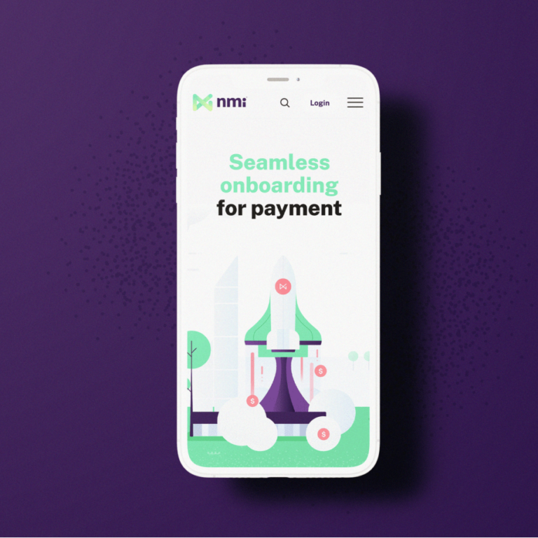
With so much thought put into our library process, we needed to ensure each illustration was carefully applied across NMI’s new site. Our web team and illustrators worked together to recommend which pages needed illustration. After collaborating with the NMI team, we moved into sketches and the rendering process to create illustrations tailored to each page’s needs.
Website Activation
Customization remained the core of our work for NMI — even during our activation process. Throughout site development, our content, design and illustration teams ensured that NMI’s site could grow with it by building flexible content blocks and modules that could change depending on NMI’s needs on different pages.
Additionally, to solve NMI’s past CMS challenges, we built a user-friendly backend in Craft CMS that enabled their team to easily navigate their CMS and make changes as the company grows.
The Results
The NMI site redesign led to a nearly 20% increase in new users to the site. But perhaps more importantly, we delivered a more cohesive, customizable application of NMI’s brand. Now, NMI owns a site that communicates their proof points across industries and flexes with their business needs.

