
Rebrand and Site Redesign Positions Provenir as an Industry Disrupter
Fintech provider’s brand identity and website are taken to new levels to break the industry mold.
Overview
As a risk decisioning company for financial institutions, Provenir delivers purpose-built technology to power credit risk processes — helping its clients make smarter decisions, faster. While the company saw accelerated growth across multiple financial verticals and launched a new SaaS product, poor website performance and outdated UX limited lead generation.
In collaboration with the Provenir team, Walker Sands worked to showcase what Provenir had become: a globally recognized firm with a knack for innovation and a deep bench of cloud-decisioning technology.
improvement in average weekly traffic
increase in clicks over two months


The Challenge
Provenir didn’t want its new website to simply stand out from competitors — they wanted a website with a disruptive look and feel that was clearly distinguished from others in their space. However, this proved challenging within the confines of the company’s existing brand. With a navigation, design and pages that looked and functioned similarly to its competitors, Provenir needed a refresh to break the mold.
Additionally, our team had to account for Provenir’s global reach. As an international company, the new site had to appeal to stakeholders and audiences around the world — not only in its content, but also in design and illustrations.



The Solution
To differentiate Provenir’s solutions and improve site performance, Walker Sands embraced a brand and web strategy that defied convention — without sacrificing best practices.
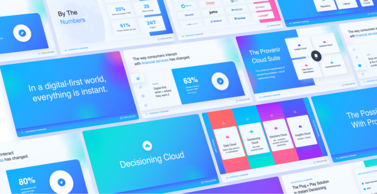
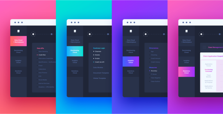
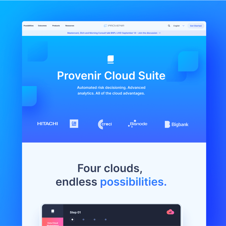
Inspired by Provenir’s desire to break industry standards, our team used bold color application and sleek, minimalistic design. Custom illustrations played into these styles, creating a homepage design that clearly demonstrated Provenir’s proof points while highlighting its innovation in the space.
Our content strategy followed suit by using messaging that broke from a buttoned-up financial voice. We incorporated a straightforward, conversational (yet trend-setting) tone, making Provenir’s voice more approachable than its competitors.
The navigation was trickier: How could we break from the industry norm without breaking from best practices? The result was a side drop-down navigation that not only looks different than Provenir’s competitors, but maintains intuitive user experiences and SEO considerations.
To account for the site’s global presence, we worked with stakeholders to identify necessary illustration, design and content adjustments, while also featuring a dropdown that allows users to toggle between languages.



The Results
The success of Walker Sands’ work with Provenir extends well beyond short-term performance improvements. By taking Provenir’s brand and website to a new level, we helped Provenir occupy a space in the industry from which it continues to innovate, redefine its market and reach new customers.

